General
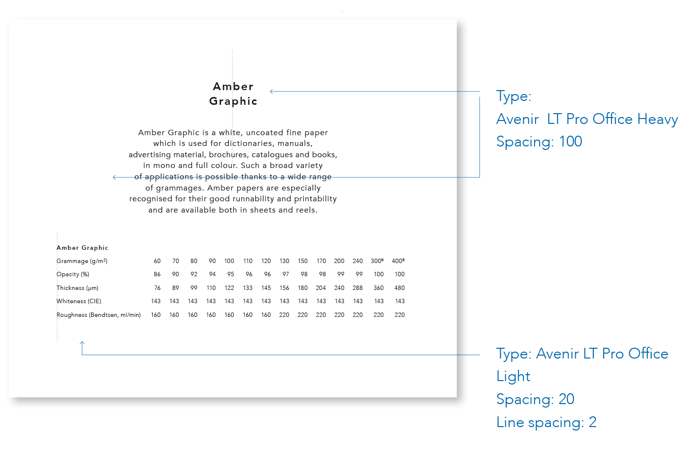
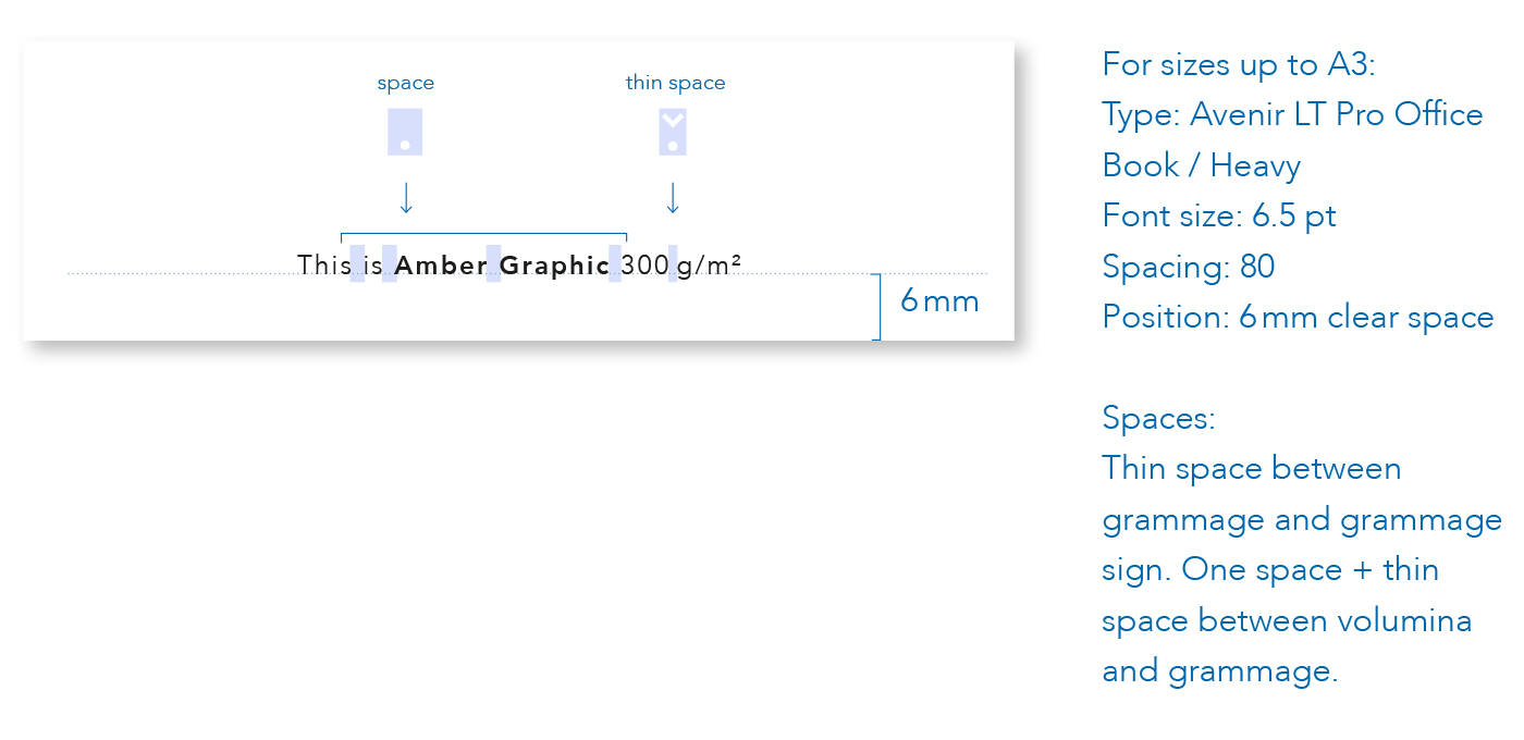
Using the right typeface and, moreover, the right version of each typeface is crucial in order to maintain the graphic profile. It should also be ensured that point size, spacing and other variables do not differ from the original version. Tables, paper descriptions and some glyphs need to be implemented as shown in the manual. Headlines and sub-headlines can be implemented in a freer manner.
Fonts for Amber
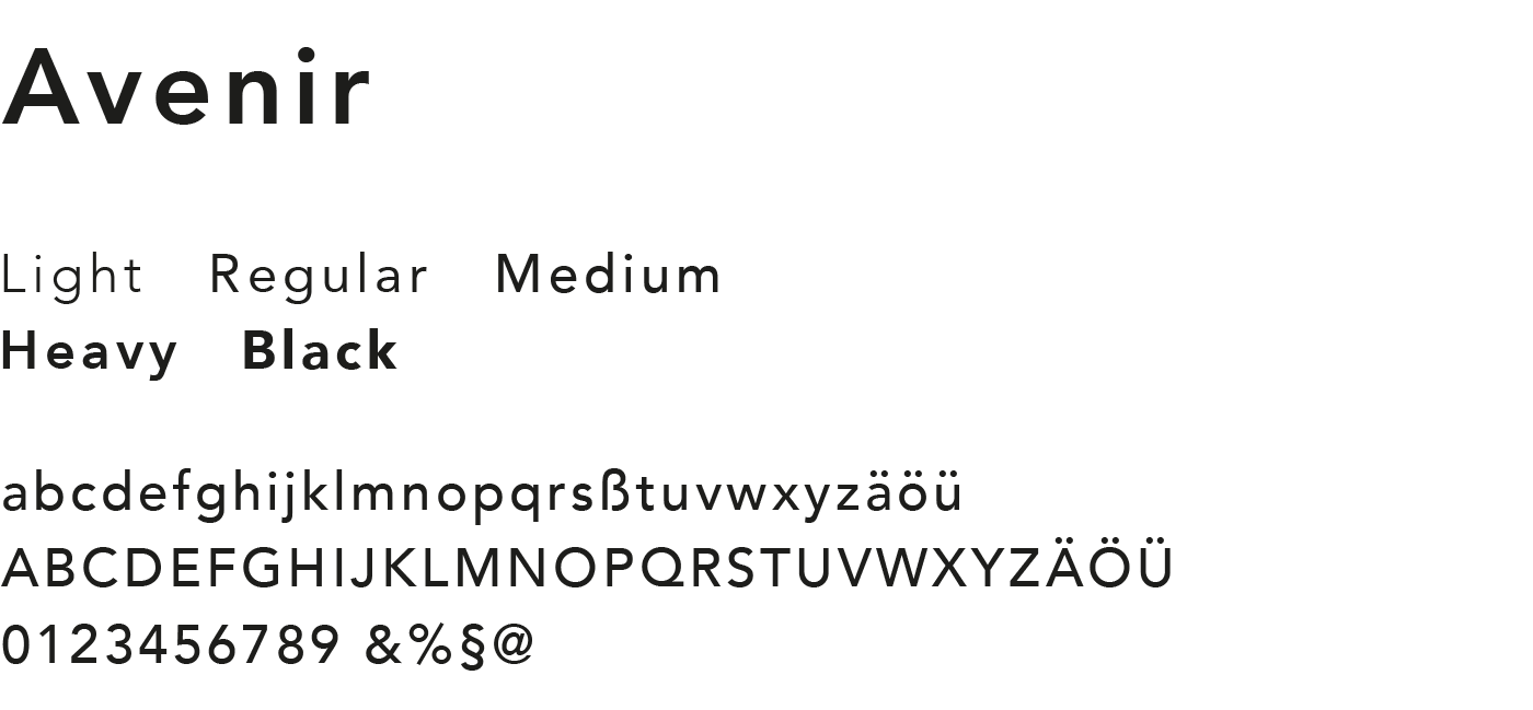
Amber uses Avenir LT Pro Office typeface for all publications, such as campaign tools and paper collections. To use the typeface, a licence for the font needs to acquired.
Typographic language
With the aid of the fonts Avenir LT Pro Office Medium and Avenir LT Pro Office Heavy, the amount of white space increases. See examples of applications below, to get an idea of the typographic style.
Tables
Grammage tables are important elements for the visual identity of Amber. They should be the same for all brands.
Paper descriptions
Paper descriptions are important elements for the visual identy of Amber. They should be the same for all brands.
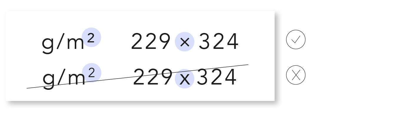
Glyphs
Please use the correct glyphs.