General
The logotype is one of the most important elements in the visual appearance of a company's brand. As a distinctive and an always present signature - it is the sender’s identification and reminder in one.
When to use
Corporate brand logotype
- Sender for Company ads
- Packaging for direct marketing, swatches, etc.
- Material for more than one brand
- In case of sponsoring
- Unit-specific (Sales Office, Mill, Headquarter) material
Product brand logotype
- Direct marketing tools
- Material for one product brand
- Product-specific ads
Note: Never use product brand logotypes and corporate brand logotype together.
Find all brand logotypes here
Logotype
The Arctic Paper logotype can be used either in colour or black and white version, which exception for corporate stationary.
The logotype must always be used as combination of word and figurative mark.

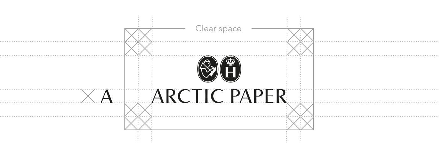
Logotype clear space
The Arctic Paper logotype should always be surrounded by an area of clear space. The minimum area of clear space is shown on the left by a rectangular box containing the Arctic Paper logo. Its construction is based on the height of the letter “A” from the Arctic Paper word mark.

Minimum logotype size
It is important not to use a smaller logo than the minimum format shown below, in order to ensure it is clearly legible and our profile remains strong and distinct. Minimum size of logo: height of the symbol 5 mm.
Logotype variants
Negative logotype
Negative logotype is to be used with uniformly coloured backgrounds or on dark images, where colour version is not suitable.

Logotype placement
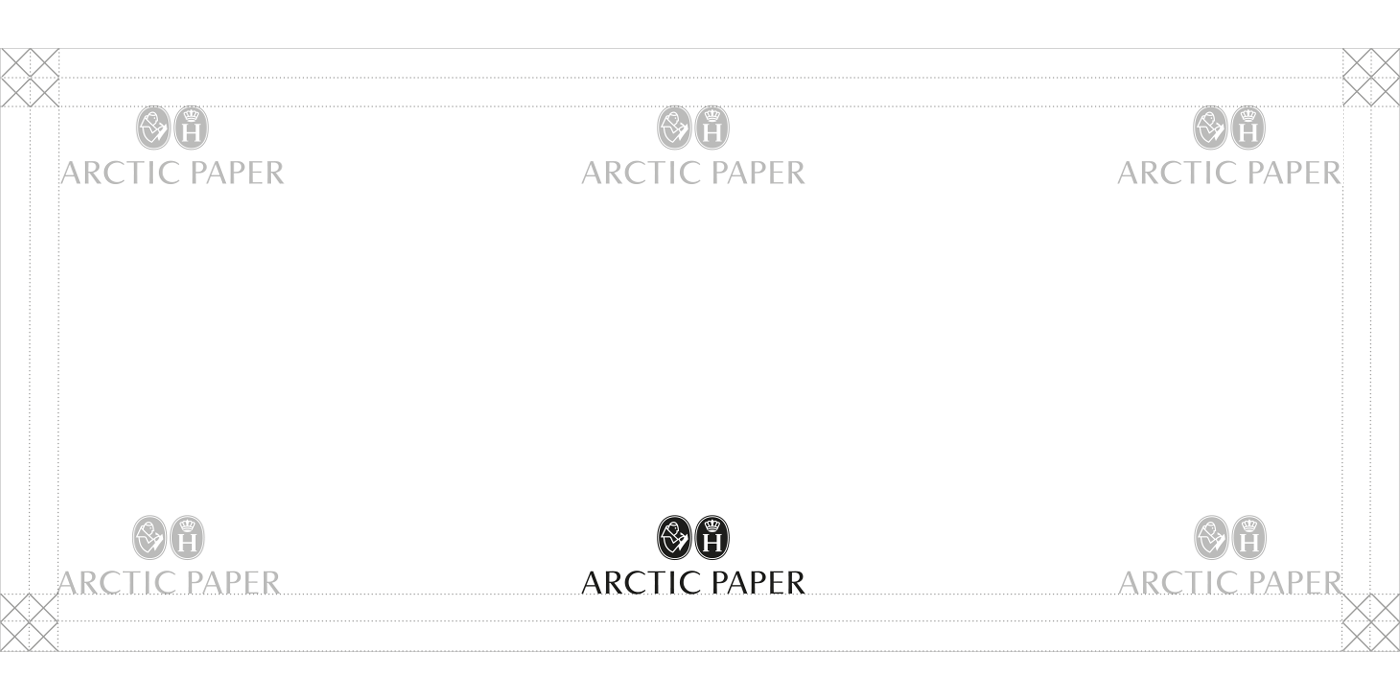
The logotype should be placed centered, bottom. Optional placement is allowed when needed (here marked in grey).
Minimum distance to border: 2 x A

Web address
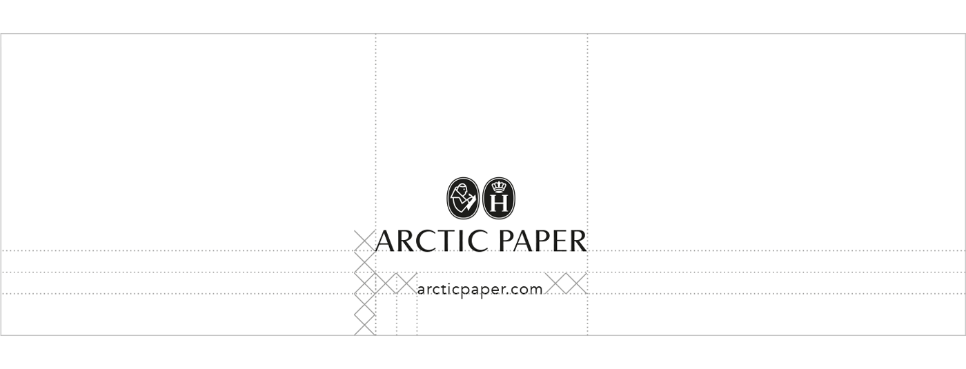
When writing the web address, write arcticpaper.com (don't use www.arcticpaper.com).
The minimum distance between the logotype and the web address: 2 x A.

