General
The logotype is one of the most important elements in the visual appearance of a brand. As a distinctive, always present sign, it is the sender’s identification, signature and reminder in one.
When to use
Product brand logotype
- Direct marketing tools
- Material for one product brand.
- Product-specific ads
Corporate brand logotype
- Sender for Company ads.
- Packaging for direct marketing, swatches, etc.
- Material for more than one brand.
- In case of sponsoring.
- Unit-specific (Sales Office, Mill, Headquarter) material.
Note: Never use product brand logotypes and corporate brand logotype together.
Find all brand logotypes here
Logotype
The Arctic logotype can be used either in black and/or white.

Logotype clear space
To ensure prominence and legibility, the Arctic logotype is always surrounded by an area of clear space which remains free of other elements such as typography and other graphical elements. The minimum area of clear space is illustrated here by a rectangular box containing the Arctic logotype. Its construction is based on the height of the letter “A”.

Minimum logotype size
The logotype should not be smaller than the minimum size of 4 mm. This minimum size has been determined to ensure maximum clarity and legibility for small applications.

Negative logotype
Negative logotype is to be used with uniformly coloured backgrounds or on dark images, where the black version is not suitable.

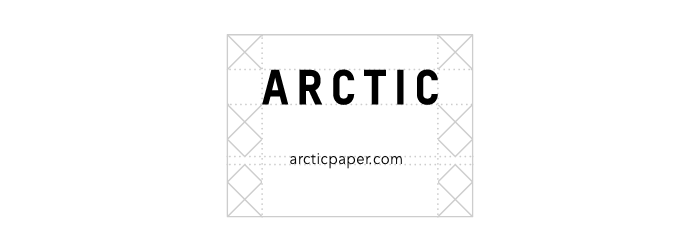
Logotype and URL
Whenever arcticpaper.com needs to be combined with the logo, the adjusted clear space needs to be respected. Arcticpaper.com is written in Avenir Book. When the logo is used in 100%, the font size is 7 pt with spacing 40.