Corporate Logotype
The core of a graphic profile is always the logo. Our logo is made up of the name Arctic Paper written in capital letters under two stylized figures, which can be interpreted as symbols for uncoated (blue) and coated (red) paper.
Product Logotypes
The product logotypes are built up according to the corporate logotype, i.e. consisting of the same symbols, colours and typeface. The colours can be interpreted as symbols for uncoated (blue) and coated (red) paper.
Each product logotype (except G-Print) therefore consist of a symbol followed by the name of the brand, with an addiction of the line “By Arctic Paper” written in capital letters in-under.
The G-Print Logotype
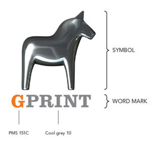
The complete logotype consists of two components: the G-Print word mark and the horse symbol mark. We prefer using the entire logotype each time we have an opportunity to do so. This is obviously the case in ads and printed matter. In other cases, we want to use it whenever space permits. That’s not always the case, however, as our logotype is comparatively tall and narrow, which makes it a bit ”big” vertically speaking, even though it’s attractive, graphically well balanced, and full of self-confidence.
Note! Sub-brand logos does not exist and should not be created.
Variations
The logotypes are available in the variations shown below. Use the colour version in positive as far as possible, otherwise use the black/white version.
It may sometimes be necessary to use the negative logo, depending on the background.
Original documents (Illustrator eps format for Mac or PC) can be downloaded from this manual. The names of the digital document files are given to facilitate management.
PMS/CMYK colour logotypes:

PMS/CMYK colour torn corner logotypes:
Black and white logotypes:

Negative logotypes:

Logotypes - where and when
Company Logo
– Sender for company ads
– Sender on packaging for DM’s, swatches etc
– Material for more than one brand
– In case of sponsoring
– Unit (SO, Mill, HQ) specific material
Product logos
– DM’s
– Material for one product brand
– Product specific ads
– wherever possible use coloured logo (PMS or CMYK)
– where not possible use negative
– size according to layout
Torn Corner
This logotype version is developed to facilitate easy usage and positioning of the combination of our logotype with the "torn corner". The "torn corner" can be usedd on an image or even on white background in e.g. ads, brochures etc.
Colours - torn corner
Note that the colours in the torn corner is black (grey) and yellow in the CMYK-version. In all other torn logotype-versions the tear is build up of just black. It is recommended that the CMYK-version should be used in advertisements and in all material where 4-colour printing process is used.
Proportions and positions
The illustrations below shows the structure and proportions between the word image/our name and the symbols, as well as the centering and positioning principle of the logotype.
Logo without torn corner
If possible, the logo should always be positioned in the top right corner and preferably in colour on a white background. The distance to the edge/trimline is shown below.
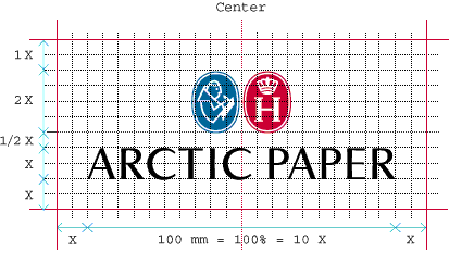
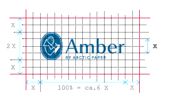
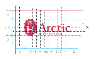
Note: These distances differ depending on format/product size, but always according to the measure “X” under “Free zone”.
Digital document size of logo: the name/text 100% = 100 mm.
Torn corner logo
The proporations between the logotype and the torn corner logo must never be modified, either in size or position. The torn logo should always be positioned in the bottom right corner.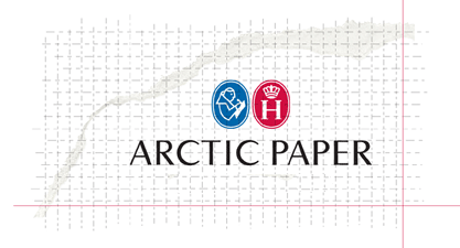
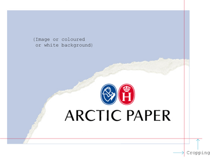
These logo files includes bleed area, and should therefore always be cropped according to the cropmarks, as shown here in grid.
Note! Examle shows torn corner corporate logotype. The same guidelines are valid for the product logotypes.
Logotype minumum sizes
It is important not to use a smaller logo than the minimum format shown here, in order to ensure it is clearly legible and our profile remains strong and distinct. Minimum size of logotype (version without tagline): the height of the symbols in the logo 5 mm.

Free zone
To ensure and strengthen the visual identity of the logo, it should always be surrounded by a free zone. Within this free zone there shall be no text, no pictures or graphical elements.
Amber, Arctic, Arctic Paper, Munken, Pamo, L-Print, AP-Tec
As a basic measurement use the height of the capital letter in the logo, marked with “X”. Use the measure “X” on each side of the logo as a free zone.
G-Print
For all versions of the G-Print logotype, the free area should be at least equal to the height of the G in the word mark.
The logotype cannot be used in very small spaces. In the case of the complete logotype (symbol + word mark), the width of the word mark may not be less than 10 mm. Where the word mark alone is used, the minimum width is 7 mm.
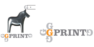
Free area for the G-Print logotype is based on the X height of the G in the word image.
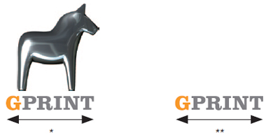
The measurements are based on the width of the word mark. Standard size 15 mm
* Minimum 10 mm for logotype with horse
**Minimum 7 mm for logotype without horse
Sizes
Minimum sizes
Munken, Arctic, Arctic Paper, Amber
It is important not to use a smaller logo than the minimum format shown below, in order to ensure it is clearly legible and our profile remains strong and distinct.![]()

Minimum size of logo: height of the symbol 5 mm.
G-Print
The logotype cannot be used in very small spaces. In the case of the complete logotype (symbol + word mark), the width of the word mark may not be less than 10 mm. Where the word mark alone is used, the minimum width is 7 mm.
The measurements are based on the width of the word mark. Standard size 15 mm

* Minimum 10 mm for logotype with horse
**Minimum 7 mm for logotype without horse
When possible always use the Arctic Paper torn corner logotype in for example ads, postcards or brochures.
When writing Arctic Paper as a graphical element in a design layout always use the typeface Avenir.
Never seperate the symbols from the text in any kind of form or media!
Our name is only written in capital letters in the logo. Otherwise it is always written in title-case, i.e. capital initials followed by lower-case letters: Arctic Paper.
The proportions between the symbols and text must never be modified, either in size or position.

