General
It is important to use the right typography and, moreover, the right version of each typeface in order to maintain the graphic profile. Also ensure that point size, spacing and other variables does not differ from the original version. It is equally important to the overall impression that the text blocks are carefully planned and have well-balanced proportions.
Correspondence, PPT and Press Releases
Verdana Bold (headlines etc.)
Verdana Regular (body copy etc.)
Typeface for ALL correspondence that is made by AP (letters, faxes, e-mails, internal PM), PowerPoint presentations and internal forms (such as Excel files).
Verdana Regular:![]()
Verdana Bold:![]()
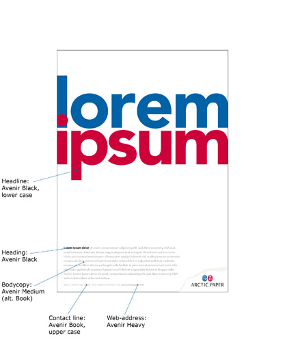
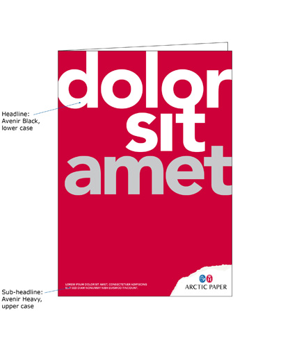
Avenir Heavy (headlines etc.)
Avenir Book (body copy etc.)
Typeface in all printed matter - for all corporate and product brand material (Amber, Arctic, Munken, G-Print) - in all graphical communication, pre-printed stationery, “pre-typed” text in templates, brochures, signs, external communication etc.
Avenir Book:![]()
Avenir Book Italic:![]()
Avenir Heavy:![]()
Avenir Heavy Italic:![]()
Avenir Black:![]()
Avenir is not a standard typeface. Each company that has a need for Avenir has to buy its own license. The other typefaces, Courier New and Verdana are standard. Typefaces can be bought from www.adobe.com, approx price SEK 300/font.
Usage in printed material
Additional typefaces for product brands
Caslon - Munken
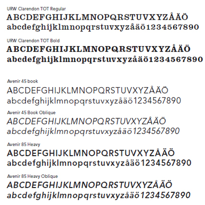
CLARENDON is a distinct and powerful antique font that communicates strenght, individually and skill. It's used mainly in headings.