General
Our product brand Arctic is defined by a set of characteristics and statements. Understanding and applying them truly and consistently in daily brand management is what makes our brand unique and attractive.
This Brand Definition is only a condensed version. If you need more information, please contact our marketing team: marketing@arcticpaper.com
Brand positioning
The choice of a new generation, idea oriented creatives.
Behaviour
Printers, Agencies, Brand Owners, Publisher, Designers, Merchants.
Target groups
Printers, Agencies, Brand Owners, Publisher, Designers, Merchants.
Core values and vision
Open minded – Design oriented – Supportive – Quality Awareness
Arctic should be the No 1 choice for the young of mind creatives.
Customer offer
A paper that delivers a better result in a wide range of creative situations.
Brand essence
Celebrating what’s different.
Logotype
The logotype is one of the most important elements in the visual appearance of a brand. As a distinctive, always present sign, it is the sender’s identification, signature and reminder in one.
![]()
The Arctic logotype can be used in a coloured or black and white version. The logotype always must be used as a combined word and picture mark.
Logotype clear space
![]()
To ensure prominence and legibility, the Arctic logotype is always surrounded by an area of clear space which remains free of other elements such as typography and other graphical elements. The minimum area of clear space is illustrated here by a rectangular box containing the Arctic logotype. Its construction is based on the height of the letter “A”.
Minimum logotype height
![]()
The logotype should not be smaller than the minimum size of 5 mm (height of picture mark). This minimum size has been determined to ensure maximum clarity and legibility for small applications.
Logotype variants
![]()
Negative logotype
Negative logotype is to be used with uniformly coloured backgrounds or on dark images, where colour version is not suitable.
When to use
Product brand logotype
– Direct marketing tools
– Material for one product brand
– Product-specific ads
Corporate brand logotype
– Sender for Company ads
– Packaging for direct marketing, swatches, etc.
– Material for more than one brand
– In case of sponsoring
– Unit-specific (Sales Office, Mill, Headquarter) material
Note: Never use product brand logotypes and corporate brand logotype together.
Colours
Colour is an effective and important part of communication. We have put to gether a clear colour palette that is in line with our identity and our logotypes. When we use these colours consistently, they help to create recognition and build our brand.
Arctic colours
Primary Colours

Arctic Paper Red
RGB 209/18/66
CMYK 0/100/66/13
Pantone 193 U/C
Note: A PMS colour sample should be used as proof for print, to ensure best result.
Secondary Colours
RGB 254/200/229
CMYK 0/30/5/0

RGB 242/130/155
CMYK 0/60/24/0

RGB 154/0/77
CMYK 0/100/30/43
RGB 232/232/234
CMYK 0/0/0/15
RGB 182/182/184
CMYK 0/0/0/40
RGB 255/255/255
CMYK 0/0/0/0

RGB 0/0/0
CMYK 0/0/0/100
The Arctic colour system consists of red hues. In addition to the primary colour, up to three additional red hues can be used. Secondary colours are used for infographics, illustrations, PowerPoint graphics, etc.
Note: Be careful with the use of red for financial data and infographics.
Colour systems
Pantone
Pantone is used when printing in separate colours, for example stationery.
CMYK
Cyan/Magenta/Yellow/Key colour = Black is used in 4-colour printing (brochures, advertisements, etc.).
RGB
Red/Green/Blue is the scale for screen colours, for example the Web and PowerPoint.
It is important to choose the right colour model for the corporate communications medium. In the download area, you can download Adobe ASE files for your working program.
Typography
Using the right typeface and, moreover, the right version of each typeface is crucial in order to maintain the graphic profile. It should also be ensured that point size, spacing and other variables do not differ from the original version.
Tables, paper descriptions and some glyphs need to be implemented as shown in the manual. Headlines and sub-headlines can be implemented in a freer manner.
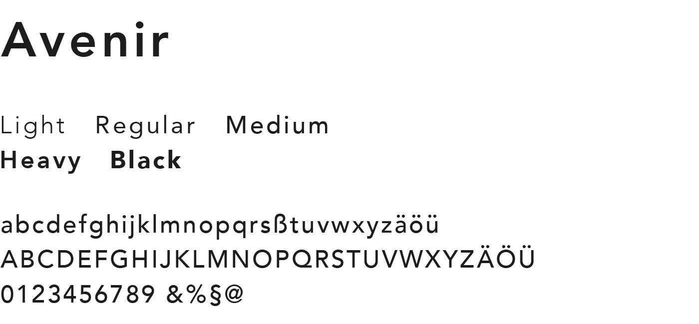
Font for Arctic
Arctic uses Avenir LT Pro Office typeface for all publications, such as campaigns. To use the typeface, a licence for the font needs to be acquired.
Typographic language
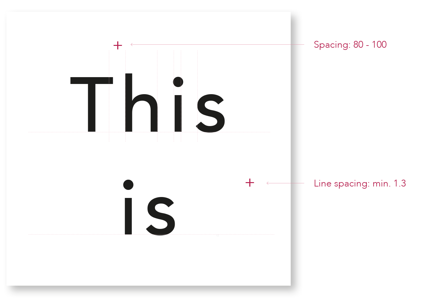
With the aid of the fonts Avenir LT Pro Office Medium and Avenir LT Pro Office Heavy, the amount of white space increases. See examples of applications below, to get an idea of the typographic style.
Headlines, Subheadlines and “small texts”
Important media such as image brochures should be designed with the fonts “Medium” and “Heavy”. For headlines subheadlines and footers for example, Avenir LT Pro Office will be used with more spacing and more line spaching as usual. To get the right feeling for using the typography, please have also a look at current applications.
Tables
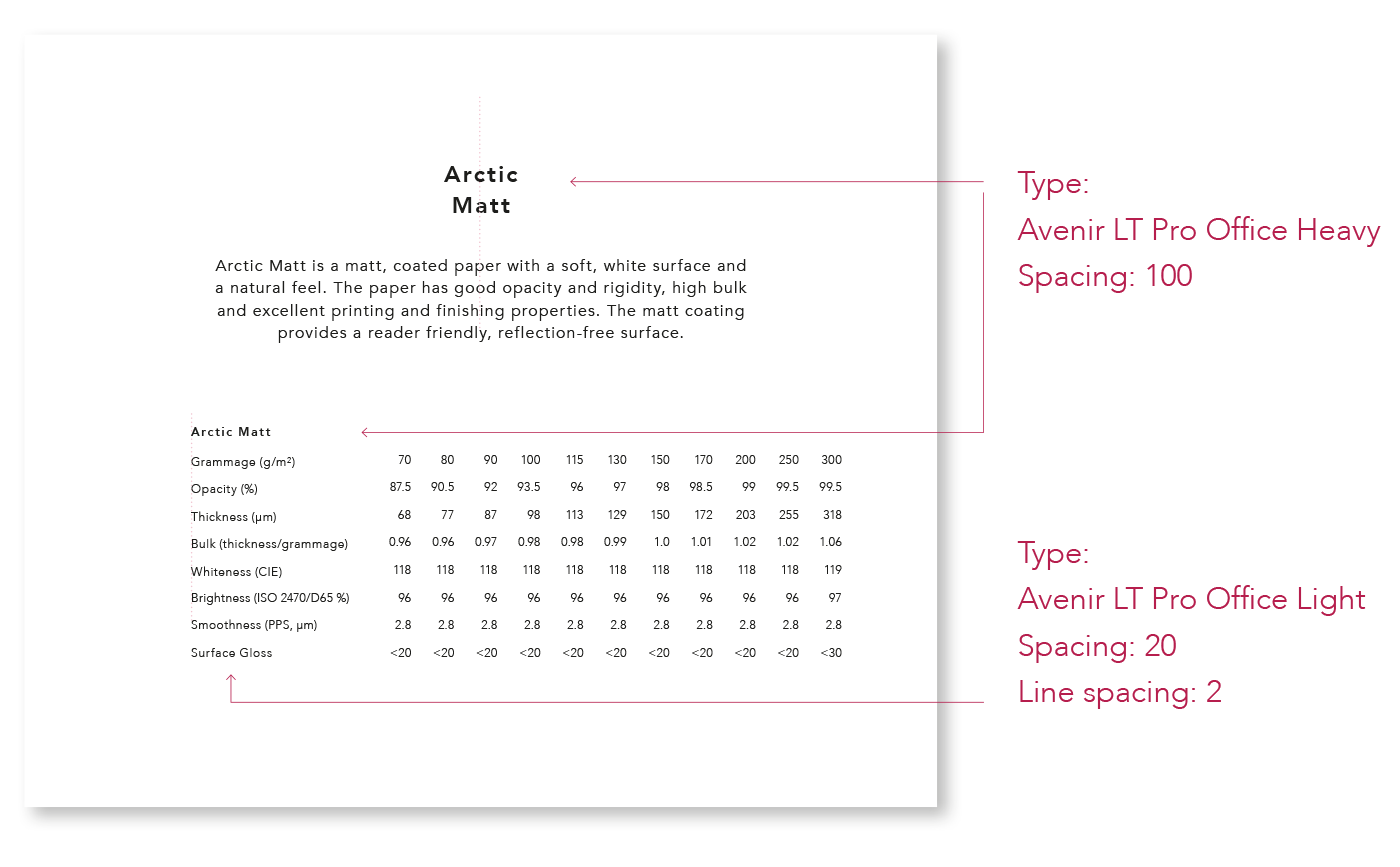
Grammage tables are important elements for the visual identity of Arctic Volume. They should be the same for all brands.
Paper descriptions
Paper descriptions are important elements for the visual identy of Arctic Volume. They should be the same for all brands.
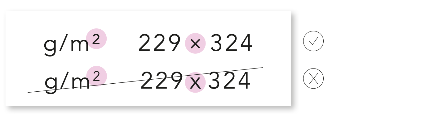
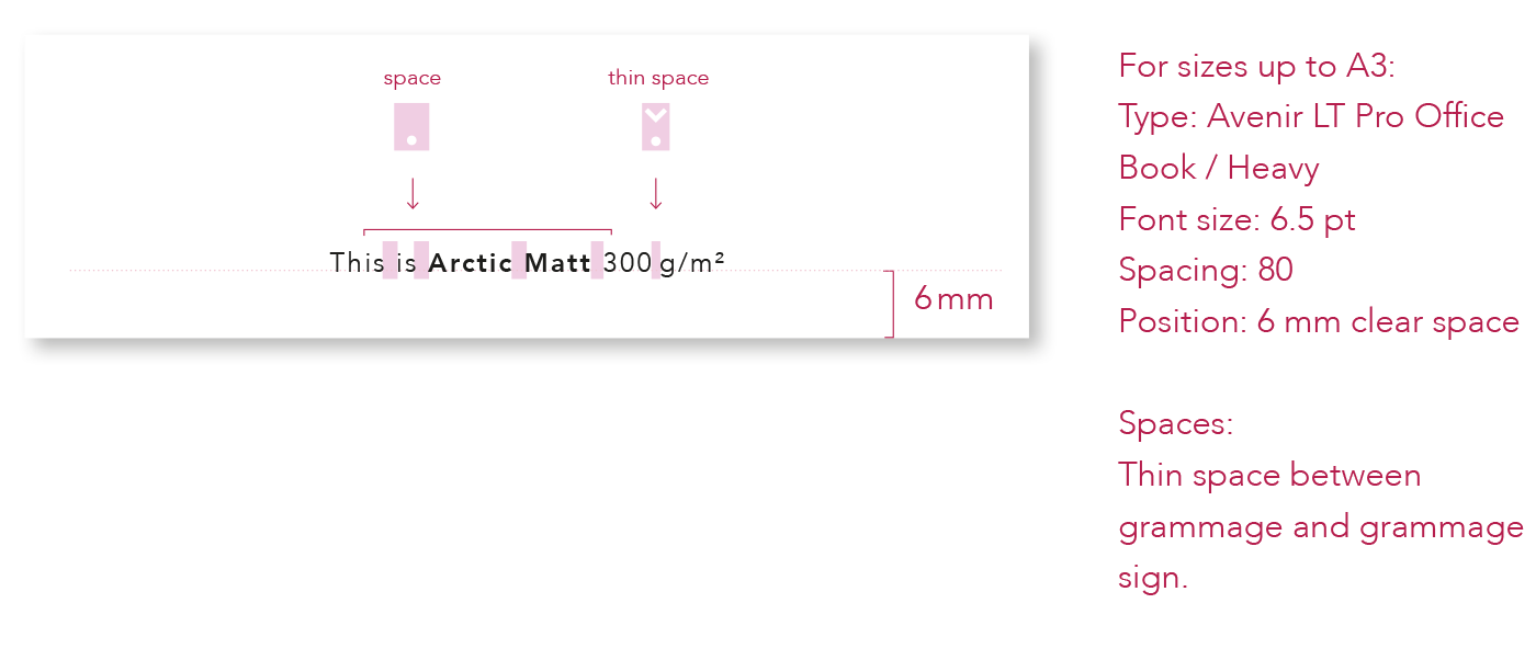
Glyphs
Please use the correct glyphs.