General
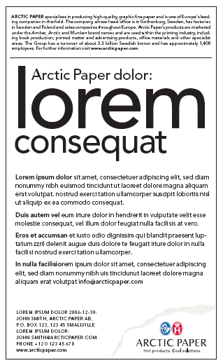
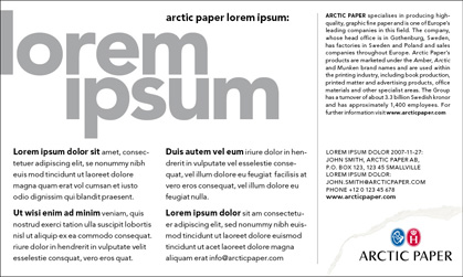
When it comes to external communication, such as recruiting, it is important to keep a uniform perception and to have a similar design of our advertisements. Shown here are some examples of recruitment ads, vertical and horizontal layout.
The typeface should always be Avenir. Avenir Medium in headlines and Avenir Book in body-copy. You can use Avenir Heavy (bold letters) or Avenir Book Italic for “highlighted” words, as shown here. Depending on the length of text/information it can sometimes be necessary to type the ad in two columns. (Similar layout – but wider).
When adding the web-address, it should be typed in Avenir Medium. All the “contact-lines” should be typed in Avenir Book, capital letters, with some extra spacing between the letters – small but readable typesize.
Always include our boilerplate to all recruitment ads, preferably the “longer” version.
Use the “torn-logo”, positioned in the right hand bottom corner, according to the guides in chapter “Arctic Paper torn-logotype”.
A frame surrounding the ad, 0,5 pt line thickness, in black, should be added (if the format not is “bleeding”/full page).
See examples for guidance of proportions and placements.
Note! It is always better to minimize the length of the information, rather than to use too small size of the typeface. Minimum recommended size of lower case body copy is 6 pt on 7 pts line spacing.
Depending on the variation of ad sizes, the recommendations for proportions and placements are rather general. Use your judgement or contact Market Communication at Arctic Paper HQ.
Layout
Example of recruitment ad, vertical/portrait layout.

Example of recruitment ad, horizontal/landscape layout.
