General
The logotype is one of the most important elements in the visual appearance of a brand. As a distinctive, always present sign, it is the sender’s identification, signature and reminder in one.
When to use
Product brand logotype
- Direct marketing tools
- Material for one product brand
- Product-specific ads
Corporate brand logotype
- Sender for Company ads
- Packaging for direct marketing, swatches, etc.
- Material for more than one brand
- In case of sponsoring
- Unit-specific (Sales Office, Mill, Headquarter) material
Note: Never use product brand logotypes and corporate brand logotype together.
Find all brand logotypes here
Logotype

Logotype clear space
To ensure prominence and legibility, the G logotype has an exclusion zone, which remains clear of other elements such as typography and graphical elements. The minimum exclusion zone illustrated here by a rectangular box containing the G logotype. The exclusion zone is based on the height of half (1/2) G.

Minimum logotype size
Minumum size is 5 mm, the measurements are based on the width of the word mark. This minimum size has been determined to ensure maximum clarity and legibility for small applications.

Logotype variants
Negative logotype
Negative logotype is to be used with uniformly coloured backgrounds or on dark images, where positive version is not suitable.

Logotype version with claim
Ideally, the logo with claim should be used, as the G logo is a new brand. But especially, when it is used outside its paper context and further clarification is needed.
Please contact marketing@arcticpaper.com to discuss the context.

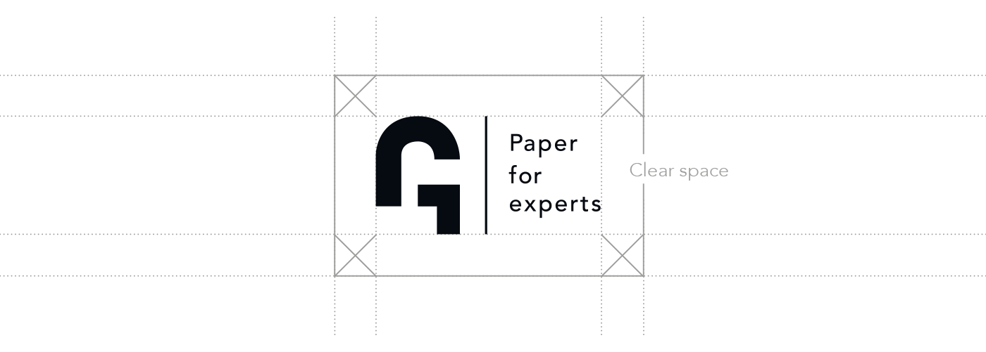
Logotype with claim clear space
To ensure prominence and legibility, the G logotype has an exclusion zone, which remains clear of other elements such as typography and graphical elements. The minimum area of clear space is illustrated here by a rectangular box containing the G logo type. The exclusion zone is based on the height of half (1/2) G.

Logotype with claim variants
Negative logotype
Negative logotype is to be used with uniformly coloured backgrounds or on dark images, where positive version is not suitable.
