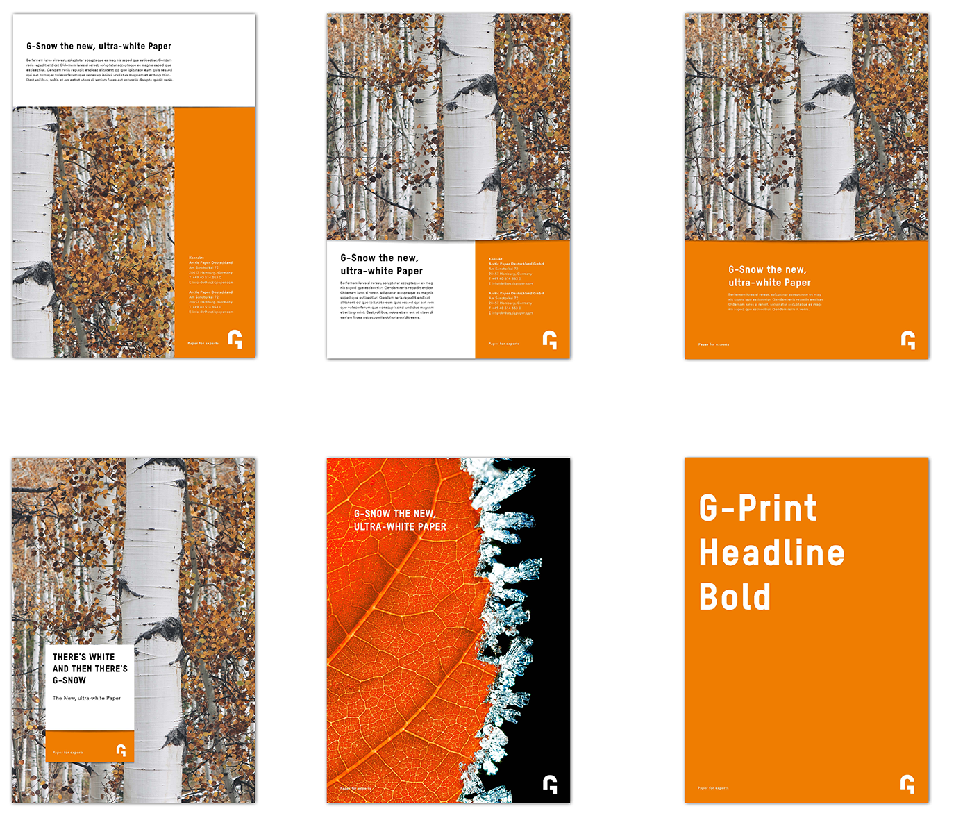
General
The G layout is very important, as it provides basic placement principles that ensure a global brand consistency. We have put together a layout guide, that is in line with our identity and our logotypes, to show you how to combine background colours with photos and text.
Using this layout consistently will increase recognition and build our brand.
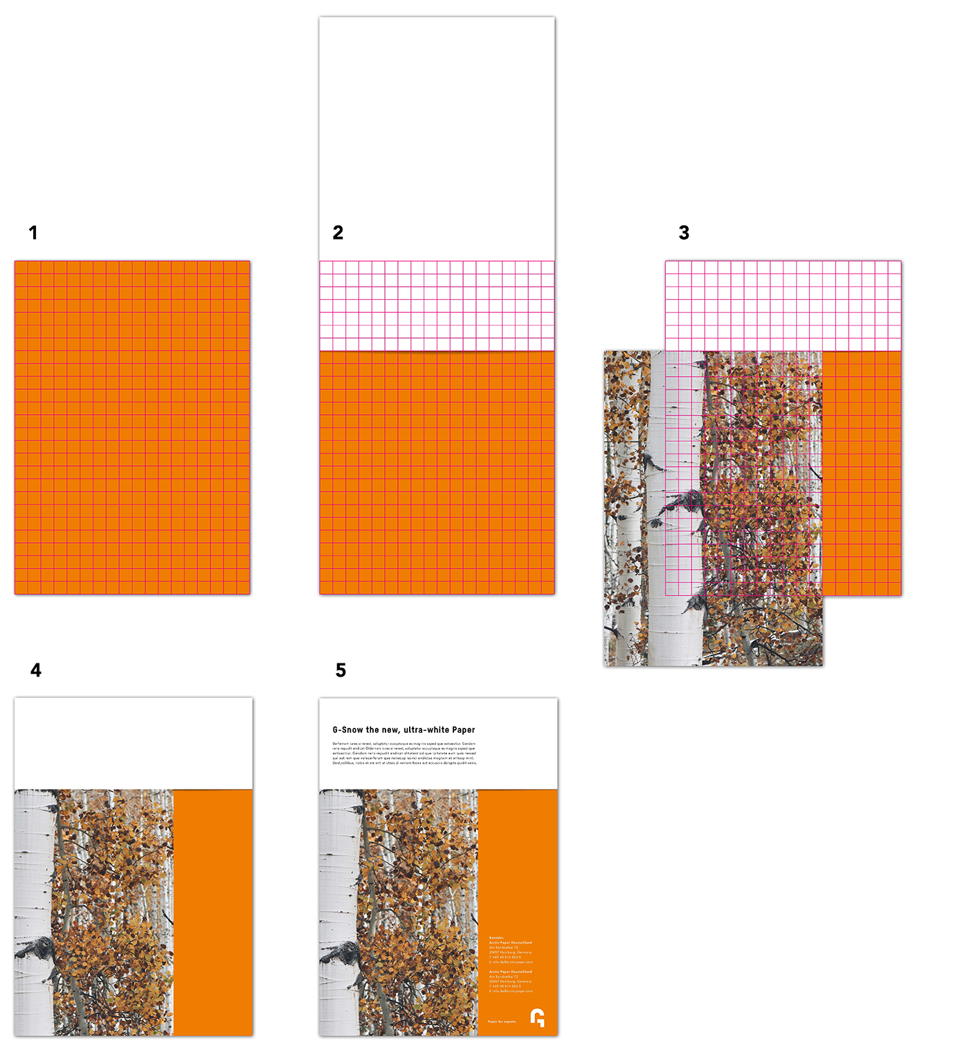
Layout - Basic Principle
1. 18/26 Grid
- 18 columns and 26 rows.
- The orange background position is set.
2. Blank paper placement
- The blank paper position is flexible on the grid.
- Surfaces beyong the grid are outside the print safe area.
3. Photo placement
- The blank paper position is flexible on the grid.
- Surfaces beyong the grid are outside the print safe area.
4. Blank paper & image layout
- This composition is the foundation for content structure.
5. Text, logo & contact details
- Text should be written in the white box.
- Where possible, the logo, contact details and URL should be written in the orange box.
Layout - Application